BRAND REDESIGN | VISUAL IDENTITY
Drogaria Nossa Senhora da Penha
A Drogaria Nossa Senhora da Penha nasceu há 14 anos e tem como objetivo oferecer seus serviços e produtos essenciais para a manutenção da saúde e bem-estar das cidades onde atua no interior de Minas. Atende a um público bastante diversificado socialmente, sexo e idade.
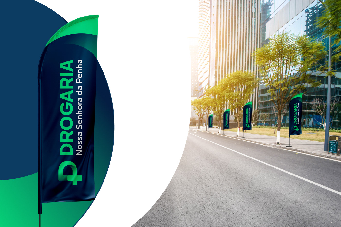
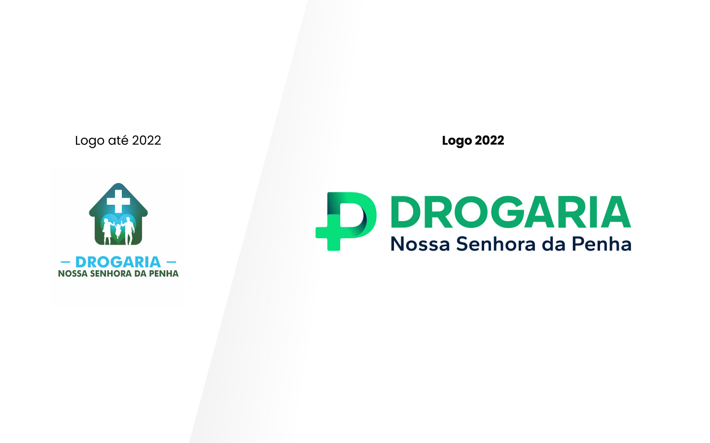
O Objetivo do projeto é modernizar a identidade visual da drogaria através de um redesign de sua marca para que ela seja reconhecida e seja referência local de qualidade, bom preço e atendimento.
Drugstore Nossa Senhora da Penha was born 14 years ago and aims to offer its essential services and products for maintaining the health and well-being of the cities where it operates in the interior of Minas Gerais. It serves a very diverse audience socially, gender and age.
The objective of the project is to modernize the drugstore's visual identity through a redesign of its brand so that it is recognized and becomes a local reference for quality, good price and service.
Conceito | Concept
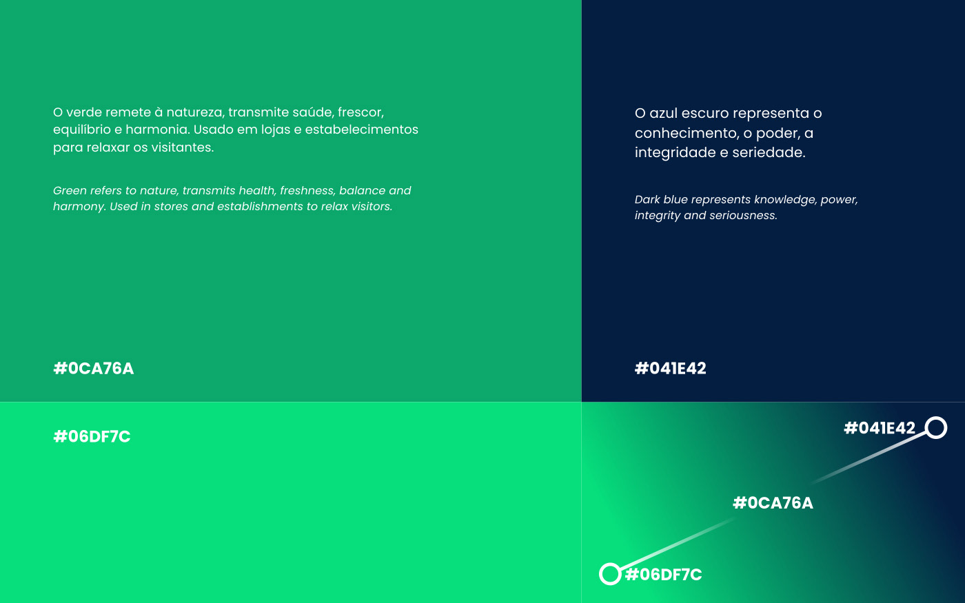
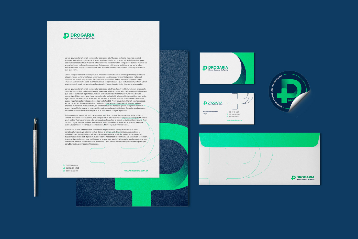
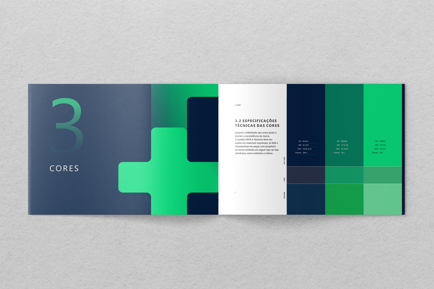
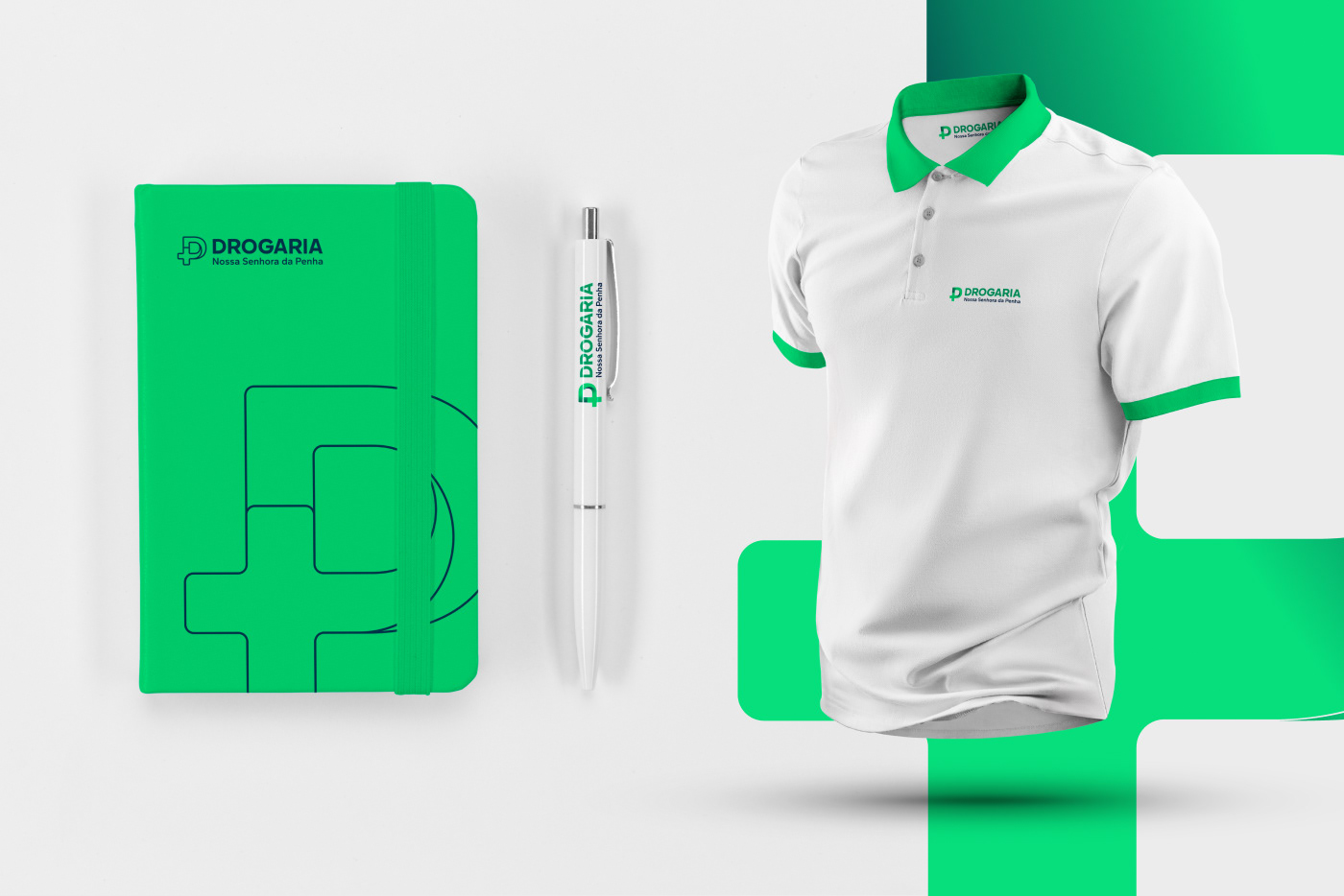
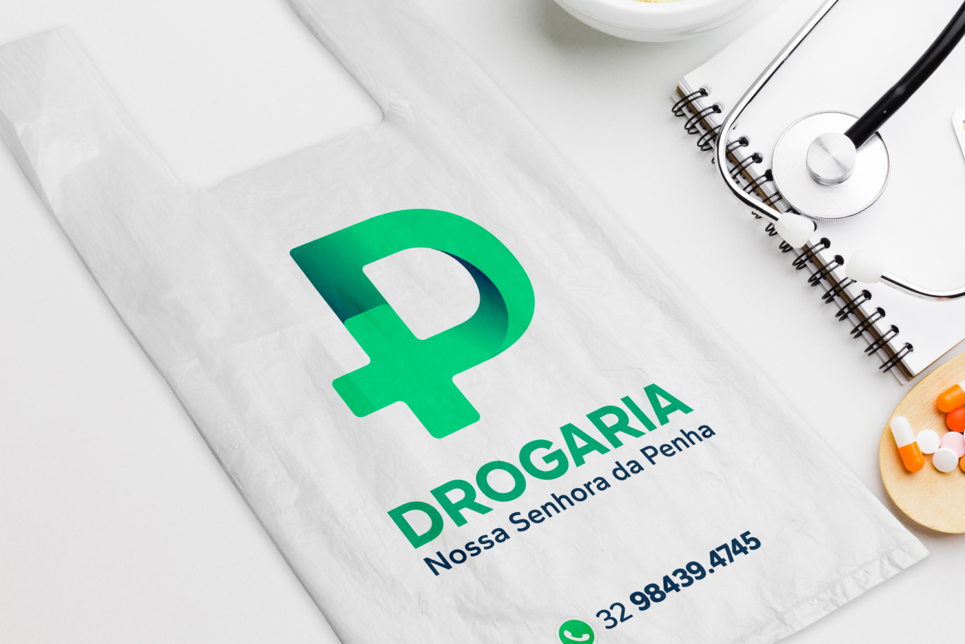
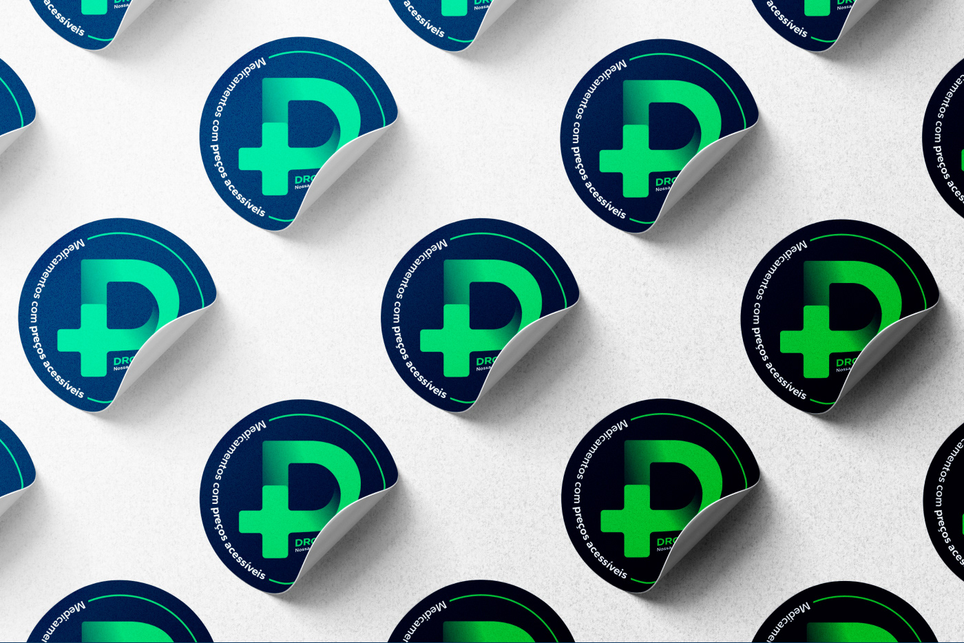
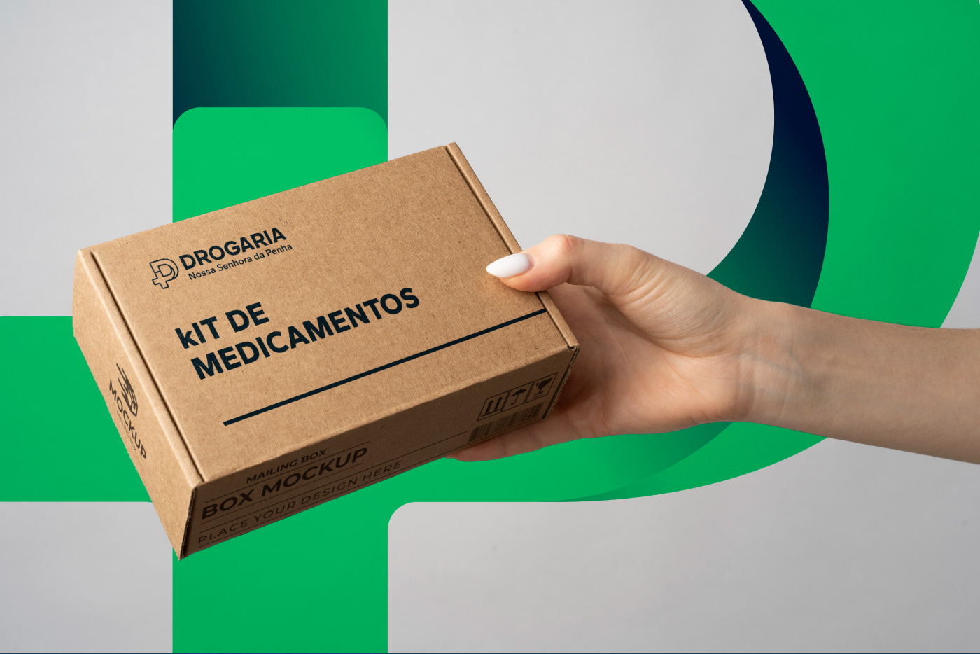
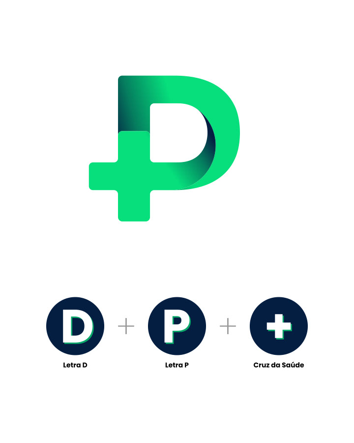
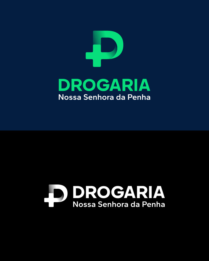
O principal conceito usado na simbologia foi integrar duas formas simples, a letra "D" de Drogaria e "P" de Penha. Juntas formam também uma cruz da saúde, principal símbolo usado no segmento.
The main concept used in the symbology was to integrate two simple shapes, the letter "D" from Drogaria and "P" from Penha. Together they also form a health cross, the main symbol used in the segment.